This book cover design story starts about seven years ago when I was eating dinner with Sherry, the genius of all things PR, in a swanky Italian restaurant. Red wine, tortellini, and a laptop with a gallery of 4 proposed cover designs for THE HIDDEN LIGHT OF MEXICO CITY. The publisher was waiting for my ideas and we were discussing each design.
The waiter stopped by. A potential book buyer! We showed him the mock covers, slowly scrolling through the presentation, and he zeroed in on a dark red cover with a grunge flag of Mexico. It was Sherry's favorite, too, and so I sent it off to the publisher as a concept to consider.
Six months later, the publisher had made a mess of the cover--and several other key elements--and we parted ways. It took another 6 months for the book to finally be published on 5 May 2012.
Related: The Lost Chapter of THE HIDDEN LIGHT OF MEXICO CITY
Since that fateful dinner at the Italian place--which has since closed, alas, THE HIDDEN LIGHT OF MEXICO CITY has had several facelifts in the quest to find its audience. Here is the story of that book cover design quest!
1. Unused publisher version October 2011
 The title is barely readable. The flag isn't centered. The writing on the left is a weird green. The back looked even worse, reducing a photo of Mexico's Zocalo to a dark blob.
2. Submitted to friends on Facebook for a vote
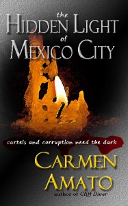 The candle concept was intended to bring together the idea of the light in the dark as well as votive candles and the Catholic Church, which is a major element of the book.
But some of the responses were "might be a vampire book" and "from a frequent traveler standpoint, I may pass on first glance on the candle - thinking it may be a love story."
So this cover didn't let readers know the book was a contemporary thriller.
3. The "Dirty Money" concept
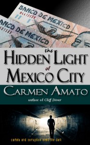 Putting the pesos on the cover was a breakthrough in the concept of the design; money laundering is what leads Eddo Cortez Castillo to uncover the political doublecross.
This cover got positive comments: "I like this one but then again I liked the flame too."
But it also garnered comments such as "light is too bright" and "where's the girl?"
4. The debut cover (2012)
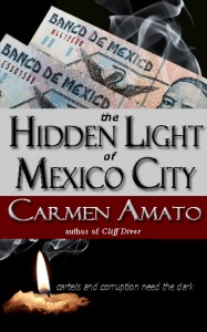 This design got some great Facebook comments and was published with the book on 5 May 2012:
"I like the red. I like the way your name pops. I also like the candle at the bottom."
"I like the position of the tag line."
"That sounds like a commitment to me!!!! I am looking forward to seeing your latest book on the shelf!"
"THIS IS IT! I'm jumping up and down."
5. The anniversary cover (2013)
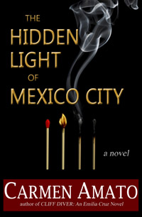 After a year there were several reasons to update the cover:
The original cover with the pesos led many to think it was a non-fiction book
The candle seemed to just float at the bottom
The tagline was too small to be read on the book's amazon book page.
A new design was needed that gave the book a stronger thriller vibe, was cleaner and less cluttered, and could be an eye-catching thumbnail. It also needed to stay consistent with my other books in terms of how my name was presented.
The single graphic did it all. As one friend said, this cover "sparked" her interest the most!
6. The romantic thriller cover (2016)
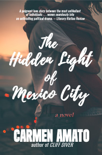 Sales weren't what the book deserved, so back to the branding and design drawing board. New tactic: emphasize the relationship at the core of the story.
The new cover put the Cinderella story angle front and center. Lovely, evocative, but somehow there was still a disconnect between the story the cover told, the story the sales description told, and the book itself, with themes of corruption, money laundering, and social inequality.
But I simply love the photo. He's holding her so tight.
Related: Check out the dreamcast!
7. The political thriller cover (2018)
 A MAJOR shift in presentation and branding, accompanied by a bold counterdrug message sales page in 2019. The second chapter, introducing protagonist Eduardo Cortez Castillo jumped the line to be the first chapter so that anyone reading the "What's Inside" on Amazon immediately gets the point of the book.
The red and sense of movement are more eye-catching than the previous covers and easier to read as a thumbnail. Once the cover and the new sales copy debuted, sales perked up.
Let's hope this is the last cover! Check out the new sales copy below.
Related: Read Chapters 1 & 2
A ruthless druglord is on the brink of buying Mexico’s presidency.
Only one man stands in his way.
In this stunning thriller from a former U.S. intelligence officer, secrets fuel the drug war raging along the US-Mexican border. On the eve of Mexico’s presidential elections, government attorney Eduardo Cortez Castillo discovers collusion between the country’s powerful Minister of Public Security and the drug cartel leader known as El Toro.
Coded messages . . . a secret website . . . clever money laundering.
"Enthralling political drama . . . Politics and corruption, and a man and woman from opposite ends of the social spectrum who fall in love." -- Literary Fiction Review
Marked for death by cartel assassins, Eduardo follows the money trail deep into drug smuggling territory. There he’ll find that violence buys loyalty, votes are for sale, and the odds are against survival.
Back in Mexico City, a woman whose name means Light of Mary waits for him.
The cartel is looking for her, too.
Grab your copy of today’s most relevant and unexpected thriller!
Critically acclaimed author Carmen Amato uses the counterdrug expertise gained during a 30-year career with the Central Intelligence Agency to weave together a story that rings with authenticity. Amato is a recipient of both the National Intelligence Award and the Career Intelligence Medal.
Not since The Manchurian Candidate has a political thriller book kept readers so riveted to characters who leap off the page. From Mexico's class system, to the country's spiraling drug violence, to the harsh realities of the US-Mexican border, get ready for a heart-stopping ride through the darkness of today’s war on drugs.
“Within minutes of reading the opening pages of this story, the reader is completely taken away and wrapped completely in the heart of Mexico City and its culture. The cornucopia of characters and their sub-stories are painted beautifully with layers of depth. Experiences are real and vividly shared . . . The peek into the classes and drug world are both captivating and thrilling.” – InD’Tale Magazine
6 Comments
You may also like
New Reader Hub! Crime fiction lovers, this is for you
If you’ve ever finished one of my books and wished you could see a map of the place? Find out more...
Introducing the Crime Fiction Files
For 7 years, mystery readers and I have connected under the banner of Mystery Ahead. That...
Speak Easy, Listen Hard: The Galliano Club Audio Experience
James Froemel is the reason why you should listen to the Galliano Club books on Audible. He's the...






Thank you! Maybe the next one will be easier!
Love the cover, Carmen. Congratulations!
Thanks, Lexi. The cover finally looks right!
I really like the progression of matches – that’s a neat idea.
I never thought of cover design as a journey but it was. Good luck on your cover–I can’t wait to see the designs.
Thanks for sharing this, Carmen! The very first cover was completely off, and the process got you through to the best one. This confirms that I’m doing the right thing, starting now to solicit cover concepts for my next novel, although publication won’t happen until spring of 2014!