Matt Chase: Detective Emilia Cruz series cover artist
Covers for the Detective Emilia Cruz mystery series are the creation of Washington, DC-based designer and illustrator Matt Chase.
The recipient of numerous awards for graphic design, Matt has created graphics for The Washingtonian, The Wall Street Journal, The New York Times, Monocle, Politico, and other international and nationally recognized publications.


How it happened
I reached out to Matt in 2016 after finding a font he designed on a creative arts showcase website. He replied and we had an online discussion of rebranding the Detective Emilia Cruz series, which at that time consisted of three books and a collection of short stories.
The first generation covers for the series used ocean imagery. They were pretty but hardly conveyed "edgy" or "police procedural."
I hoped Matt could bring the sharp and modern look I saw on his website to the series. The covers had to be clearly identifiable as a mystery series, but I wanted the sun-drenched colors of Mexico to make the books stand out in the crowded mystery category. We discussed creating a signature look across the entire series, similar to the covers of the Harry Hole mysery series by Jo Nesbo.
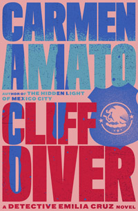
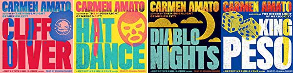
Matt came through with five trial designs, using HAT DANCE, the second Emilia Cruz novel, as the guinea pig. As soon as I saw the design with the yellow background, I knew he'd hit a home run.
Using stucco textures, bold colors, blood streaks, sans serif fonts, and stamped-on graffitti, Matt gave the series a bold and eye-catching look. If you see a cover, you immediately know it's a Detective Emilia Cruz mystery.
He also designed the graphics for the audiobook versions of the first four Detective Emilia Cruz novels narrated by Johanna Parker, now available on Audible.
The design process
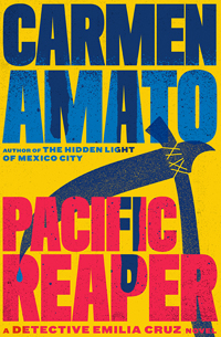
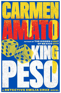
For each Emilia Cruz cover, Matt and I trade emails about themes in the book and nail down ideas for the motif. Once that is worked out, he'll create a couple of preliminary cover mock-ups. It's always hard to choose between them, although sometimes one jumps out, like the scythe motif for PACIFIC REAPER.
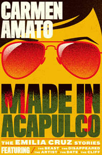
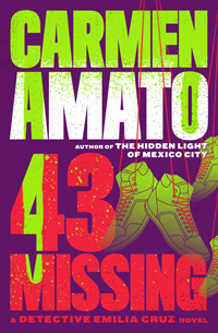
Color and details now get tweaked. For example, for the cover of MADE IN ACAPULCO, Matt experimented with the size of the sunglasses but neither of us was fully satisfied until he added arched eyebrows that perfectly captured a female vibe. By the same token, the cover of 43 MISSING needed to convey multiple disappearances; once Matt faded the shoes in the background the design said it all.
Find out more
The cover redesign was well worth it. Sales immediately jumped and at least once a week a reader says how much they love the covers.
Matt Chase's gorgeous website showcases many of his design projects and illustrations. Check it out at chasematt.com.